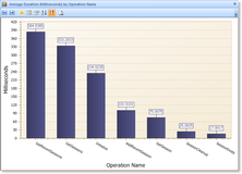
This example chart was created by selecting a string value (Operation Name) as the Group By value and then Average Duration for the initial series.

Example Bar Chart |
In this initial configuration, you can:
- Change the sort order by clicking on the Sort Ascending or Sort Descending buttons
- Change the number of decimal places used to display values by using the Increase or Decrease Decimal Places buttons.
- Edit the series definition by selecting any of the series data points and clicking the Edit Properties button.
- Add additional series by clicking the Add Series button.
Multiple Series on the Same Chart
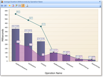
For this example, we've added two new series displaying the same data but selecting Maximum Duration and Minimum Duration instead of Average Duration:

Example with Multiple Series |
Multiple Y Axis Units
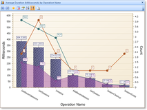
In the example above all of the series share the same unit (Milliseconds) only one Y axis is displayed and all of the series are scaled to that axis. If a series is added that uses a different unit, a secondary Y axis will be created. For this example, we've added one more series to show the Count of Events in each group:

Multiple Series with Multiple Axis Example |
Because the count of events is not in Milliseconds, a second Y axis on the right has been created. You can optionally display each distinct Y axis on its own panel by clicking the appropriate toolbar option.