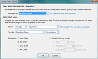
When you drag an Event Metric onto an empty Metric Chart, the Create Chart Dialog is displayed.

Create Metric Chart Dialog |
Major Options
Grouped By
Selects the value from the event metric to use for the X (horizontal) axis. Typically this is a qualitative (text) value representing a characteristic of the event instead of a numeric value. the blue text to the right of the combo is the description of the current selected value.
If you select a numeric value to group by, you will be presented with a new set of options to determine how to group:

Create Metric Chart - Numeric Grouping Options |
These additional options are necessary to produce a reasonably bound number of groups for a wide range of numeric data. There are two ways that the numeric data can be summarized:
- Create a group for every N: Create a variable number of groups based on a fixed width of values.
- Create N groups covering the data: Create a fixed number of groups based on the range of values in the data.
Additionally, you can group all values over a threshold together to prevent a small number of outlier values from compressing the scale for the bulk of the data.
Chart
Select what value to display on the Y axis and how to summarize the values from different events. The blue text to the right of the value combo is the description of the current selected value.
Sort By
Selects whether to sort by the Y axis or X axis values, ascending or descending.
Limit to the top results
If the selected Group By value has a large number of possibilities it can be very useful to only chart items that are significant. All of the values that are below the selected threshold get grouped together in an "Other" data point. You can limit by:
- Top N Values: Select just a fixed number of groups. You may end up with this plus one more group to represent all of the values that were put together as "Other".
- Percent over N Percent: Select all of the groups that represent more than a fixed percent of the total.
- Value over N: Select all of the groups that have a value over a fixed threshold.