A Metric Chart provides graphical analysis of event metric data, leveraging the additional data values recorded with each event to produce pie, bar, line, and area charts of the data grouped by different characteristics of each event. Metric Charts only work with Event Metrics. To display Sampled Metrics, use a Metric Graph or Metric Grid.
Creating a new Metric Chart
To create a new Metric Chart, click on the New View button on the top left of the toolbar then select New Chart in the New View Dialog. This will create a new, empty chart ready for metrics to be added. Multiple metric charts can be used at the same time for a session.
Working With the Chart
Adding the First Series
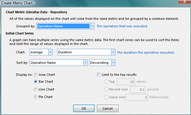
Drag any event metric from the Metric Explorer on the left onto a metric chart to display the Add Metric Series Dialog. For the first series, this displays an extended set of options that define the primary characteristics of the chart, in particular what data is displayed on the X axis and how it is sorted.

Create Metric Chart Dialog |
For complete information on how the Create Metric Chart Dialog works, see Loupe Desktop - Metric Chart - Create Chart Dialog.
Adding Additional Series
Once you've created the chart, you can add additional series from the same event metric by clicking the Add Series button in the toolbar for the metric graph. When you do, the Secondary Chart Series dialog is displayed

Create Secondary Chart Series Dialog |
The secondary series data will be grouped and sorted identically to the original series.
Editing Series Definitions
Select a data point in the series you want to edit or select the series from the Presentation tab and then click the Edit Series button in the toolbar. The appropriate edit dialog will be displayed.
Adding Metrics
You can have any number of event metrics on the same chart. You can add additional metrics by dragging them from the Metric Explorer or by double-clicking them in the Metric Explorer. When you add a metric, only detail columns that are common to all of the metrics on the chart are available.
Printing or Exporting a Chart
Once you have a chart formatted to your satisfaction you can print or export the chart by clicking on the Print Preview button in the chart toolbar. By default, the chart is configured for letter size printing in landscape mode.
You can also export from this view directly to PDF or to an Image. The latter is particularly useful for copying into an external presentation tool like PowerPoint or for displaying on the web.
Exporting to PowerPoint
To get a completed chart into Microsoft PowerPoint, first click the Print Preview button in the chart toolbar then select File->Export Document->Image File to save the completed document as a graphics file. Once it has saved, you will be asked if you want to open the new file. If you select Yes, it will open in the default viewer for graphics files on your computer, which typically will allow you to drag and drop the image directly into your presentation. Alternately, you can import the saved file into PowerPoint.
When exporting to an image, you may want to select a higher resolution if you expect people to print the chart in its new form. The default setting of 96dpi is optimized for screen display. A setting of 300dpi is useful for print-ready images.