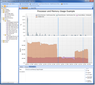
A metric graph displays the numerical trend data for any metric defined in the session. Metrics are added by selecting them in the Metrics tree view and dragging them onto the metric graph. If the metric is compatible with an existing axis it will be added to that axis. If no compatible axis can be found a new axis will be added.

Metric Graph |
There are two types of metrics supported by Loupe. Sampled metrics, like windows Performance Counters, are recorded as a value sampled on a periodic basis. When graphed, a line is drawn through the samples to create a trend line on the graph. When a sampled metric is dropped on the chart it is immediately displayed.
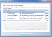
Event metrics are much more sophisticated and support multiple values which may not necessarily be numeric. When graphed, event metrics are translated into sampled values by either averaging, summing, or counting the values in a given time interval. When an event metric is dropped on the chart a selection dialog is displayed:

Event Metric Trend Selection Dialog |
This dialog allows the user to specify which value(s) of the event metric should be added to the graph and adjust the time interval used to generate the sampled value set. Clicking on a specific trendable value in the event metric will cause a preview graph to be displayed.
Creating a new Metric Graph
To create a new Metric Graph, click on the New View button on the top left of the toolbar then select New Graph in the New View dialog. This will create a new, empty graph ready for metrics to be added. Multiple metric graphs can be used at the same time for a session.
Configuring the Graph
Metrics
Each metric trend that has been added to the graph is listed with a default caption and several options that control how it is displayed.
- Caption: The label to use for the analysis trend in the legend.
- Group: The group of metric trends it is being displayed with (see Groups below)
- Start Timestamp: Optional. Instead of starting with the earliest data start with the specified point in time.
- End Timestamp: Optional. Instead of ending with the last data available use the specified point in time.
- Interval: To create the metric trend the original data is being broken into samples based on the interval. Each metric has a default interval set when it was recorded. You can change the interval to whatever you desire from very short to much longer to help show trends over time or track very small changes.
- Units: The units the data was recorded in, such as % or operations per second or bandwidth. Loupe will automatically treat some units specially, in particular % or percent are automatically set as percentages and units that include common bandwidth names (such as mbps or kbps) or memory sizes (such as mb) have special scaling applied automatically.
- %: Indicates the provided value is a percentage and needs to be treated as such instead of a raw decimal value. Loupe scales 1.0 to be 100% in percentage mode.
Groups
All of the metrics on the same group will be displayed in the same panel. If they have the same units they'll also share the same axis. As metrics are added to the graph they will be automatically grouped together based on their units to minimize the number of panels.
Groups also control the way metrics are viewed - using an Area, Line, Full Stacked Area, or Full Stacked Line chart.
- Full Stacked views normalize multiple metrics so they add up to 100% and show the ratio of the values over the time range.
- Area and Line views show the absolute value of the metrics over the time range.
Presentation Options
- Title: A title is generated automatically based on the metrics selected, but you can generally create a better title manually. Just type one in the Title area to show it at the top of the chart. If you want to hide it, uncheck Title in the Show options.
- Show (Title, Legend, etc.): You can hide a number of elements from the chart to simplify the display as desired.
Printing or Exporting a Graph
Once you have a graph formatted to your satisfaction you can print or export the graph by clicking on the Print Preview button in the toolbar. By default, the graph is configured for letter size printing in landscape mode.
You can also export from this view directly to PDF or to an Image. The latter is particularly useful for copying into an external presentation tool like PowerPoint or for displaying on the web.
Exporting to PowerPoint
To get a completed chart into Microsoft PowerPoint, first click the Print Preview button in the chart toolbar then select File->Export Document->Image File to save the completed document as a graphics file. Once it has saved, you will be asked if you want to open the new file. If you select Yes, it will open in the default viewer for graphics files on your computer, which typically will allow you to drag and drop the image directly into your presentation. Alternately, you can import the saved file into PowerPoint.
When exporting to an image, you may want to select a higher resolution if you expect people to print the chart in its new form. The default setting of 96dpi is optimized for screen display. A setting of 300dpi is useful for print-ready images.
Zooming in long time frames
If a session was running for a long period of time it will have accumulated a large number of samples. While the grid will still perform well in this scenario, it's often useful to zoom in the timeline to show finer details for peaks.
- Zooming In: Shift-Click and drag on the metric chart to highlight the length of time you want to have expand to be the entire graph. You can then scroll the graph left and right to view the entire timeline.
- Zooming Out: Right click on the graph and select Reset Zoom to zoom all the way back out.
Synchronized Time Selection in Views
Each of the metric graphs and the log message view are synchronized. The thick blue line on the graph indicates the time selected. Clicking at another point on the chart will change the synchronized time point to the nearest matching point in the session. Using this feature, you can select a suspicious point in the log or in the metric graph and then switch to another view and see the same point in time.